Prince Orthodontics
Project summary
This logo was selected for the final stage in an online branding contest, although it was not selected as the winning design. It shows my creative process and it received positive and extensive feedback from the client. You can find the actual design contest at:
https://99designs.com/logo-design/contests/modern-logo-design-prince-orthodontics-1309534/entries/
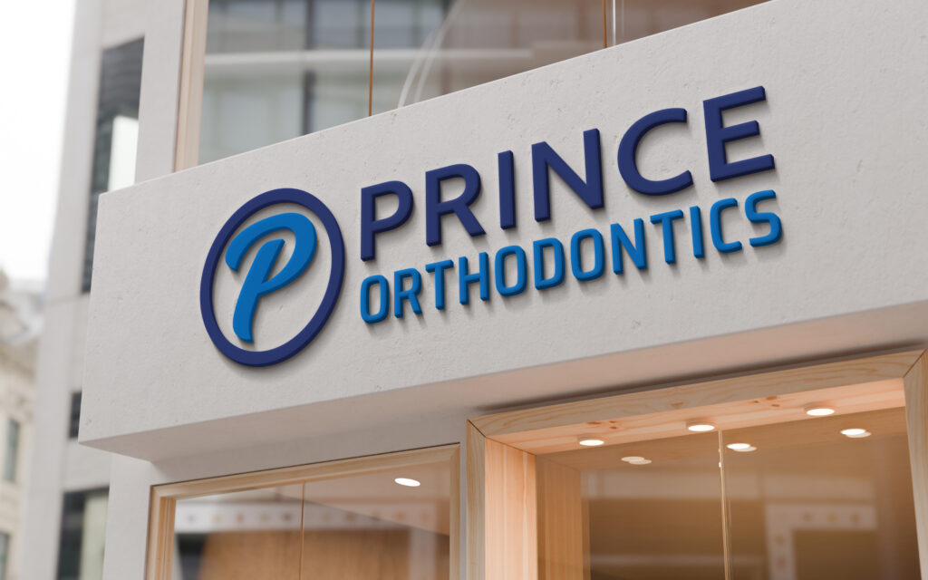
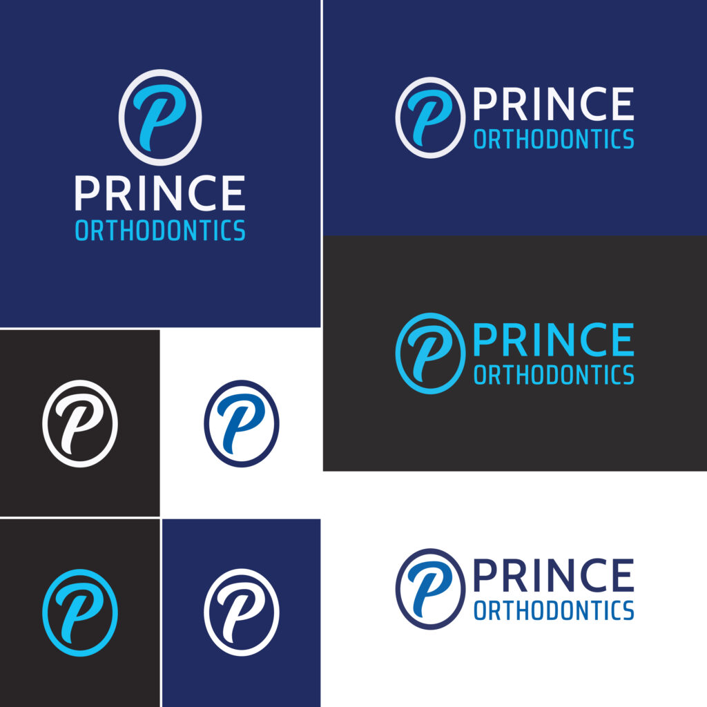
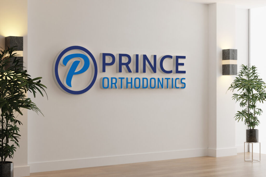
Prince Orthodontics is a modern orthodontic office that delivers exceptional service and smiles. The client wanted a geometric and modern logo with a formal character to best represent the company. The colors had to be on a blue palette with monochromatic alternatives. The brief’s challenge was to design a logo without using a tooth or teeth icon. Instead, create a symbol using the letter “P” and right next to it place the title “Prince Orthodontics”. The word Prince had to be on top of Orthodontics and have the exact same width across.
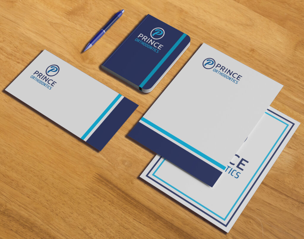
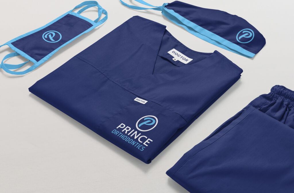
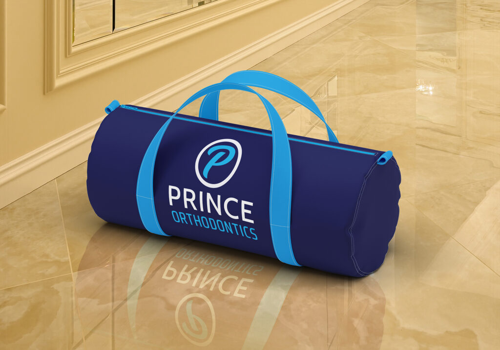
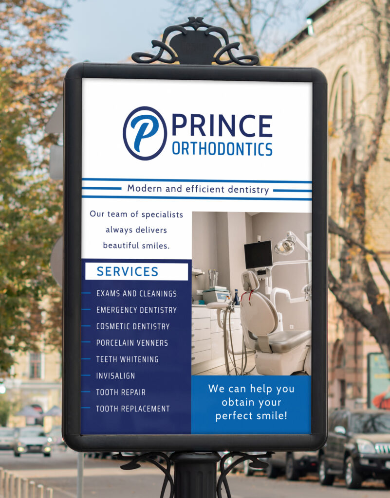
There are horizontal and vertical versions of the logo for different presentations and purposes, that can be applied to a range of marketing material.
