Painting Hangout
Project summary
Painting Hangout is a painting studio located in New York City, offering painting lessons and artistic group experiences. In this creative environment there is a blend of art and relaxation in one delightful experience. Talented instructors guide students through creating their own masterpieces, with insightful explanations and techniques from the art world. At Painting Hangout it’s a paint party where everyone’s inner artist shines! You can visit the official website at:
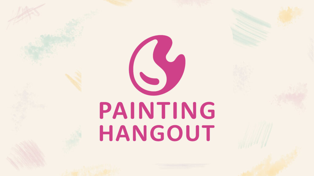
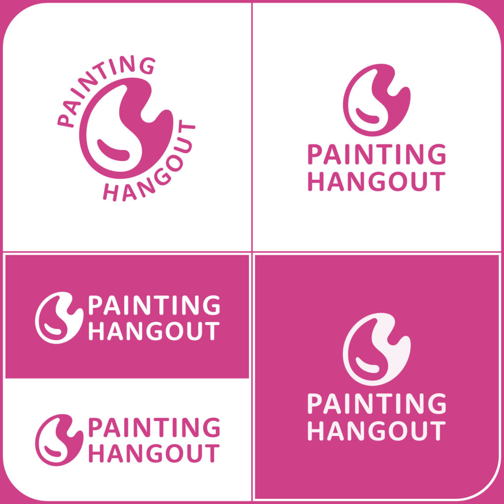
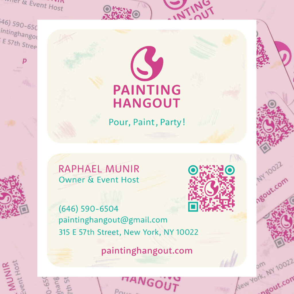
To represent the Painting Hangout brand, the client wanted a friendly and inviting logo to express creativity and enjoyment. The idea of a droplet of paint materialized using the proportions of the golden ratio, as a nod to the classic art world and the essence of the company. To further emphasize the painting identity, the droplet was placed inside the silhouette of a paint palette. All the vector construction took place considering scaleability and usability for publicity material and web development.
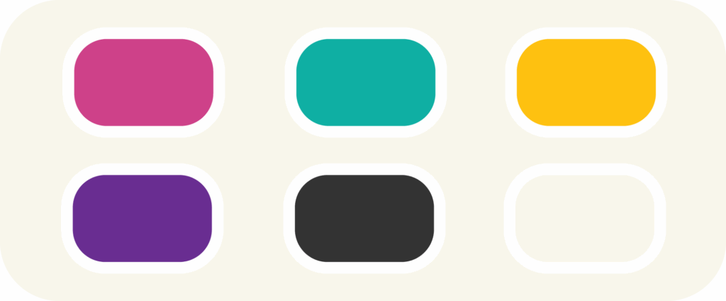
The official brand color palette is applied over all the publicity material, to create contrast and a colorful environment.
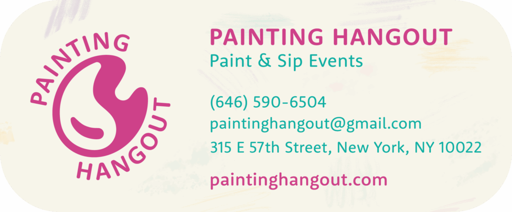
A set of business cards was created, using an original background made with the primary colors. Strokes of paintbrush are scattered all across to symbolize creativity and spontaneity.
To communicate online an email signature includes all the contact information, maintaining brand identity and using the logo variations according to space and distribution.