City Gallery Framing
Project summary
City Gallery Framing is a custom framing and art restoration business located in Midtown East, Manhattan. With over 25 years of experience, their framing and artwork are world renowned. From locals in the neighborhood to big corporations, they have been the go-to for many around the world. With professional framers, City Gallery Framing helps their clients select the perfect frame, mat, and glass to complement their artwork. This project includes branding, marketing and a website that you can find at:
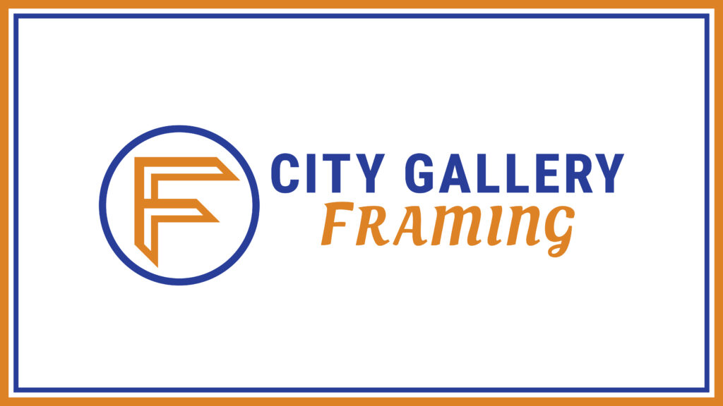
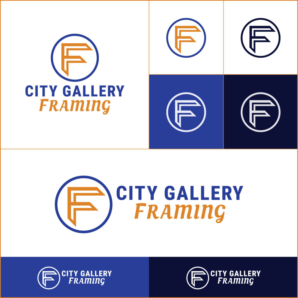
The branding process began with defining the core of the business and the values of precision and accuracy. Frames had to be at the center of the brand mark, according to the client. So the composition became a geometric abstraction of the letter F, including frame corners. The typefaces used represent the combination of both modern and classic styles combined.
After the logo variations were created, the next step was to develop an animation that introduced the brand to the public. This animation represents the creative process behind the selection of the right frame for an art piece. Two corner samples are put on display to compare them and one of them is selected as the winner. Then another corner is overlapped on top to form an abstract design of the letter F for Framing.

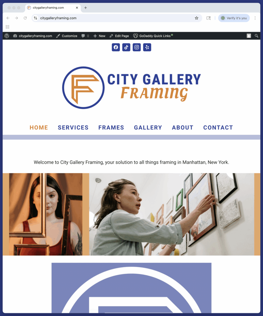
A website was developed using WordPress to educate the audience about the company’s products, services and benefits. Various pages include promotional material and are linked together with a series of buttons and clickable images. Social media links and contact information are placed conveniently inside the footer of every page. Pictures and descriptions of the products are organized in columns that get rearranged depending on the size of the browser window, to optimize usability.
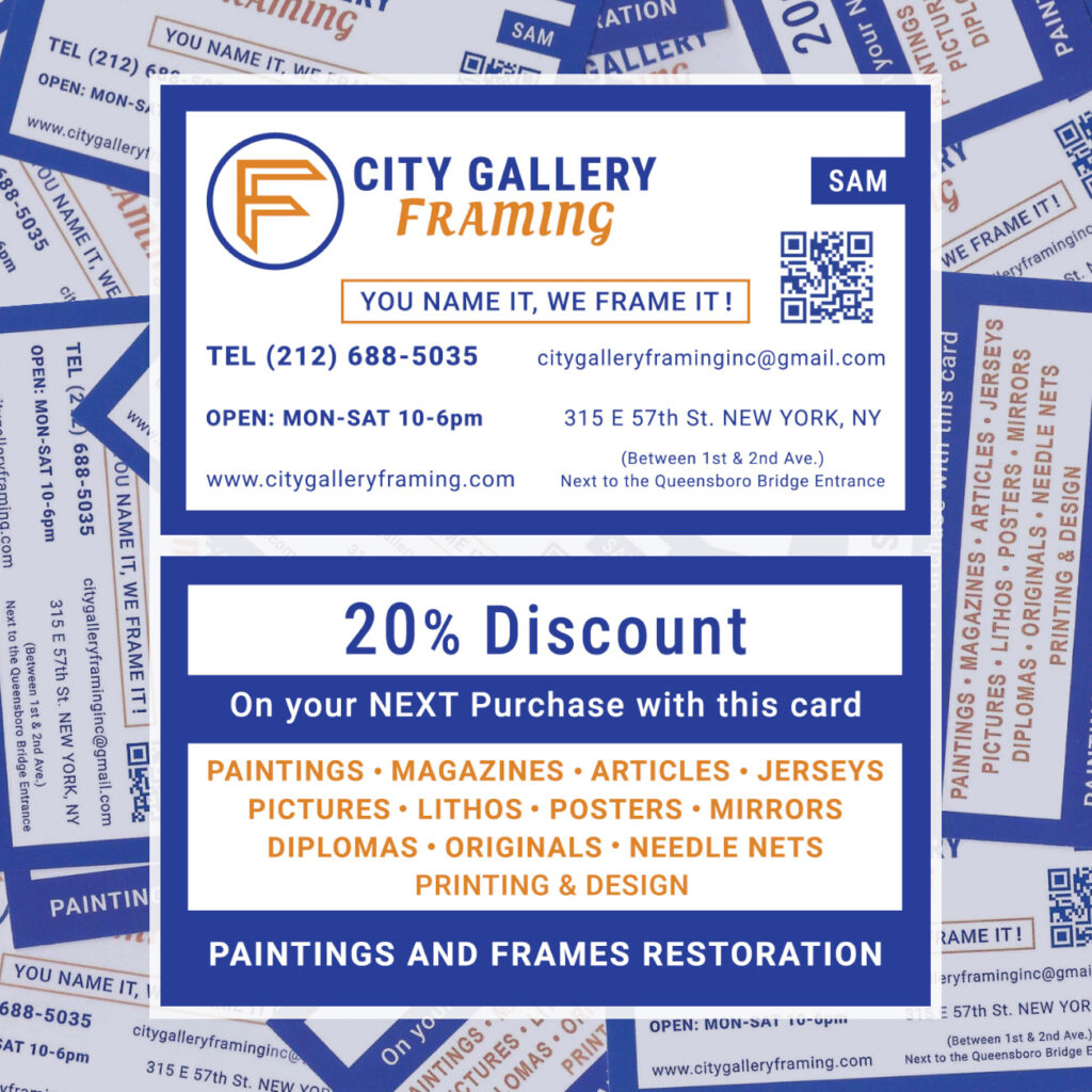
To distribute physical collateral material, a line of business cards was created using Illustrator and InDesign. All the contact information was strategically placed for visual clarity and distribution balance. A practical QR code directs the user to the website and the colors preserve brand awareness with other corporate materials.
Video reels are part of the content material to promote the brand online. These videos were made using Premiere Pro, by editing clips and sequencing effects.
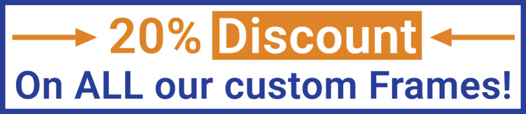
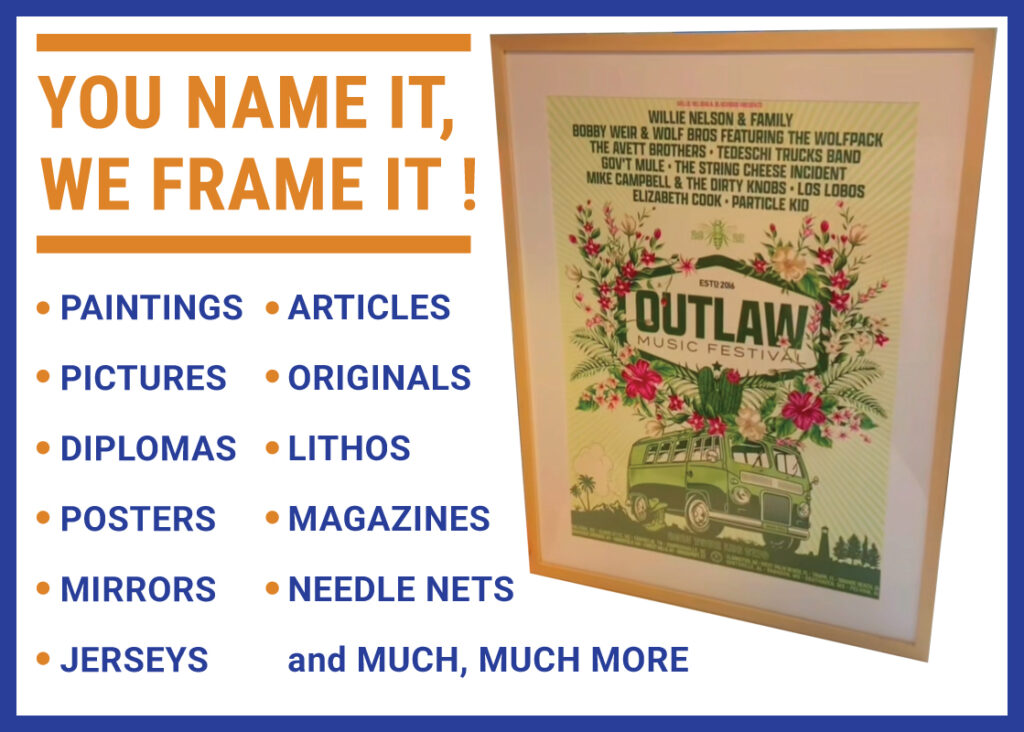
Marketing banners can be found throughout the website and are constantly being updated with the latest work.